
NY Ballot Redesign
Elections are too important to use ill conceived and poorly designed ballots. The New York State ballot is one of the more difficult to navigate and disenfranchising designs. This project was a pursuit of discovering why the ballot exists in its current condition, what plans are in place or underway to correct these problems, and how future ballots can be improved. Three ballots were created incorporating a spectrum of legal compliance and best design practices. The design for Version 1 ignores some best design practices in order to minimize the amount that would change from the original ballot. Version 2 is the result of complying with all the New York State laws in addition to following all the best design practices. The last version, Version 3, sacrifices some legal compliance in order to make the best designed ballot possible.


Version 1
This design considers the legal requirements more important than design. It most closely resembles the original but sacrifices best design practices to be achieved.
Version 2
This design considers the legal requirements equal to the design. It disregards the original ballot, complies with all NY laws regarding ballot design, and incorporates best design practices.

Version 3
This design considers the legal requirements less important than design. It sacrifices legal compliance to achieve best design practices. It is the greatest deviation from the original ballot design.
Jump to:
Introduction

My roommate’s absentee ballot which sparked this journey.
Elections and the policies of our electors are closely watched and have become ever more critical. My roommate and I voted absentee for the November 2018 election. When we looked at both of our ballots, mine from Travis County in Texas, and hers from Orange County in New York, we were shocked at the starkly different styles and methods that our precincts used to elect officials. The Texas ballot has plenty of room for improvement, but I found my roommate’s ballot particularly troubling.
I had a difficult time understanding how this ballot worked, what different symbols meant, why candidate’s names were listed more than once, why it looked like the same candidate was representing different parties, why a candidate could be listed multiple times if they’re running unopposed, and why the ballot was so compressed.
The poor design of the ballot made me wonder how reliable the results could be. I decided to learn more about why the official ballot is so difficult to navigate, including what the New York law dictates, and what design practices I could implement to improve the voter experience.
Process
Research
Around the time I decided to pursue this project, there was an interview on the NPR show All Things Considered about confusing ballot design. During that segment I learned about the Center for Civic Design (CCD), a non-profit organization dedicated to improving ballots and voter abilities across the country. I reached out to them, and they pointed me to a Medium article with many resources to begin my research.
My research took me in different directions such as to articles from The Washington Post, to presentations on voter research, and to suggestions on ways to improve the current New York State ballot. To accomplish this, one of the obvious questions I needed answering was why this ballow allowed the same candidate to represent more than one party?
New York is one of eight states which allows for Electoral Fusion, which is when a candidate can represent more than one party, and a citizen must be able to vote for a candidate from a particular party. This method of voting allows minority voices to be heard, represented on the ballot, and have a chance to make an impact. In theory, it allows for more nuanced voter opinions to be heard by officials without necessarily overcrowding the field with different, single-minded candidates. For example, a citizen can vote for Andrew Cuomo, who is also representing other groups, through the Women's Rights party because that's what they believe in more than the Independence or Democratic parties. Which is why a ballot cannot group all parties a candidate represents under that candidate’s name.
The CCD’s website has Field Guides for the many different aspects concerning the voting process, one of which is the ballot design itself. I learned about the Help America Vote Act of 2002, which established the federal Election Assistance Commision (EAC) in an attempt to bring the country to more modern voting methods and techniques and provide guidance and standardization to the states on how they conduct their elections. The EAC published a report in 2007 on the Effect Designs for Administration of Federal Elections, with Chapter 3 covering Optical Scan Ballots (aka paper).
I then turned my attention to the specific laws for the State of New York. I read about a report from the Comptroller on Voting Reform in New York City, which covers updates to many aspects of the voting process, including ballot design, and the New York Board of Elections proposal for 2018, which repeals some of the more antiquated laws. This report also mentions enacting the Voter Friendly Ballot Act, which also repeals antiquated laws, updates current laws, and adds new laws to reflect our current technology. Assembly Bill A9607** enacts the Voter Friendly Ballot Act and has passed the State Assembly and is currently in review by the State Senate, as of January 9, 2019.
Here is a page which includes most of the research links I followed and found important.
**Update: As of January 23, 2019 Assembly Bill A9607 has been replaced by Assembly Bill 2682A and Senate Bill 2300A as the most up-to-date legislation to fix the ballot. The verbiage concerning the ballot’s design was unchanged, so my ballots do not need changing either.
Update: March 5, 2019: Senate Bill 2300A passes and is now on the the Assembly calendar.
Update: March 11, 2019: Assembly Bill 2682A was substituted for Senate Bill 2300A and passed. Unless the Governor vetoes the bill, it will become law in time for the 2020 presidential election.
Aggregating Information
Assembly Bill A9607 is the most recent, and closest, bill to becoming law, and it updates ballot design legislation. While it hasn’t been approved by both the New York Assembly and Senate, I decided to follow what the bill dictates as a demonstration on what the New York ballot could be.
I am not a lawyer, so reading the bill was an exhausting exercise because of the manner in which it’s written. I imported the bill into a document editor, in this case Google Docs, and commented the necessary lines with my own plain-language translation. I then consolidated all of my comments with their original text in another document, and used that to gain an understanding of what the law will require.
During this time, and while going through my research, I was collecting notes on everything I had discovered with regard to the best design and legal requirements for ballots.
These notes allowed me to sketch what the ballot layout would be and to cite my sources in case I needed to reference them later.

Significant Legal Changes
Below are a list of what I considered major beneficial changes to the incoming legislation in Bill A9607:
No more black hand with pointing index finger
Sans-serif fonts only
Voting instructions will be accompanied by an illustration
Put the voting oval to the left of the candidate name
Do not use all capital letters
Use 1 font or font family
No party emblems on the ballot
Left justify all text
Shading may be used
Distinguish between instructions and the first contest through white-space, illustration, shading, color, font size, or bold type
Letters must be used to designate party rows but do not need to be affixed to a candidate
I’ll include them discretely anyway as a redundant method for determining party affiliation
Constraints
Before designing any ballot, I imposed the following restrictions on myself.
Must comply with all current and/or upcoming laws
Utilize best design practices
I will be using the Arial font family because it is a standard sans-serif I already have. However, I would recommend using the ClearviewADA font family in the future.
All current candidates, their offices, their parties, and any other information on the current ballot must remain
Cannot be more expensive than current methods
Greyscale
Paper cannot be any bigger that the latest ballot
Result
From the sketch, I chose to create 3 new designs weighing the state's legal requirements against good design practices. The content is from an original November 6, 2018 New York Orange County ballot, which I’m calling the “current ballot”.
Unless otherwise noted, all these ballots follow the requirements set forth by Assembly Bill A9607 and EAC recommendations pertaining to ballot design.
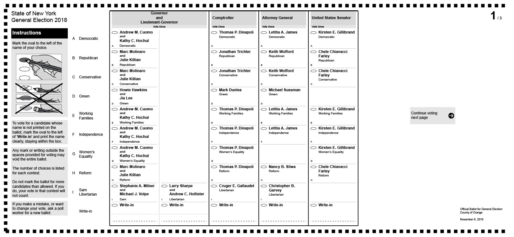
Version 1
The first version considers the legal requirements more important than design. It most closely resembles the original but sacrifices best design practices to be achieved, while still obtaining a user-friendly ballot.

This version of the three designs is most consistent with the original. It is still a single page and one-sided, but feels very constrained and constricted by using smaller font points and forcing the contests to bunch together. However, it incorporates some design techniques to improve its usability: shading is added to identify the contest and number of votes allowed; thick vertical lines are used to act as a barrier between contests; and a thick perimeter border separates the contests from other information, such as the parties ballot information.
Technical Areas of Note
This ballot is one-sided, or on one page, like the current version. The dimensions of this paper ballot is 22.75” x 10.5”. This was extrapolated from the only photograph I have of the original, and while an odd dimension, it does fit within the parameters of the machines used by the State of New York.
The candidate names, and the office titles they are running for, are all at 9 pt.
The word “and” separating the candidates for Governor and Lieutenant-Governor is set to 7 pt. The font type Arial doesn’t offer a “slim” option, so to compensate the party name is set to 7 pt size and 2 pt beneath the candidate names.
The instructions to “Vote Once” or “Vote for any Seven” are at 7 pt.
The amount of horizontal space allowed for Governor and Lt. Governor is 1.25”, while the rest of the candidates receive 0.95”.
The lines on the outer perimeter of each contest is a solid stroke of 2 pt line weight. The line across the top of all the contests is still 3 pt line weight. The lines dividing the candidates within each contest have stroke weights of 0.25 pt.
The instructions on how to use this ballot are assumed to be on another sheet of paper to save space and because this is an absentee ballot.
Version 2
The second version considers the legal requirements equal to the design. It disregards the original ballot, but complies with all NY laws regarding ballot design and incorporates best design practices.

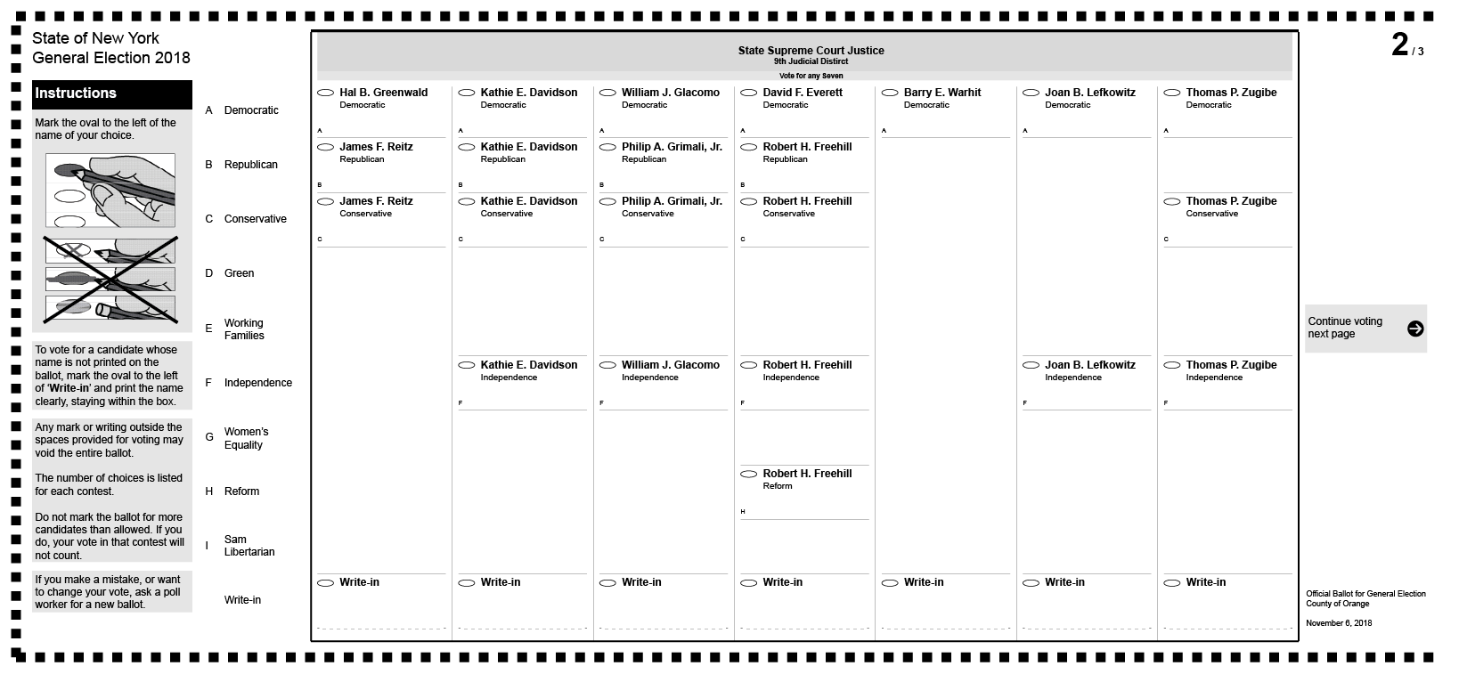

This version has the same benefits as the previous and shares many characteristics with the original. It can be seen as a further improvement upon Version 1 of the ballot by including more design features and allowing the content to breath and expand across multiple pages, one benefit being the contests are all the same dimensions and don’t crowd each other.
There is no law requiring the ballot to be on one page, therefore this ballot occupies as much space as necessary to follow all upcoming laws in A9607 and recommendations by the EAC.
Instructions are written on all pages of the ballot because there are more than 2 pages to the ballot, and was intended to prevent people from having to search through multiple pages to find them. Also included is an illustration on how to properly mark the ballot.
Page numbers are placed in the top-right corner as well as signage to indicate more contests on other pages.
Technical Areas of Note
The dimensions of this paper ballot is 22.75” x 10.5”.
The lines on the outer perimeter of each contest is a solid stroke of 2 pt line weight. The line across the top of all the contests is still 3 pt line weight. The lines dividing the candidates within each contest have stroke weights of 0.25 pt.
Version 3
The third version considers the legal requirements less important than design. It sacrifices legal compliance to achieve best design practices. It is the greatest deviation from the original ballot design.


This ballot is the most radically changed from the original. It is in a vertical, or portrait, orientation, yet still has the same paper dimensions as the original ballot and the previous versions.
The instructions are listed only on the first page of the ballot. Because the ballot only requires two pages, and can assumed would be printed front and back, the instructions should be easy to find. The instructions have subheadings and are reorganized to better reflect this. The bottom of the instructions have a section for Straight-party voting. This ability was included because, as an indirect benefit to putting all Democratic, Republican, Conservative, etc. candidates on the same row, the original design makes it is easy to identify and vote for all candidates of a particular party. The law does not directly prevent Straight-party voting, however it does dictate that all candidates and the parties they represent must be adjacent to one another, which effectively outlaws Straight-party voting. The language used in the instructions explaining how Straight-party voting works was taken from the Texas ballot, then was reworded to use simpler language as suggested by the CCD.
The ballot contests “begin” with a Straight-party voting. The order of the parties in this contest is the same as is found on the current ballot.
The candidates in each contest have been rearranged such that each candidate is grouped together with all the parties they represent. This was done to better find candidates and see which other parties support them. It is also easier to see if candidates are running unopposed. If a candidate is representing multiple parties, the parties for that candidate are put in the hierarchical order they appear on the Straight-party contest. They are separated by a dotted line of 0.5 pt. Distinct candidates are separated by a solid line of 0.5 pt. The order in which the candidates run against each other in a contest correspond to the same hierarchical order of parties in the Straight-party contest and can be visualized in this way:
Democratic > Republican > Conservative > Green > Working Families > Independence > Women’s Equality > Reform > Sam > Libertarian
The State Supreme Court Justice contest has been broken up into seven different contests, with each contest having the instruction to “Vote Once”. The candidates in each contest were determined by the column they were in in the current ballot.
Technical Areas of Note
The dimensions of this paper ballot is 10.5” x 22.75”. This is the only ballot I designed presented in portrait orientation.
The lines on the outer perimeter of each contest is a solid stroke of 2 pt line weight. The line across the top of all the contests is still 3 pt line weight. The lines dividing the candidates within each contest have stroke weights of 0.5 pt.
Lessons Learned
Designing a ballot is not as easy as writing a candidate name with their party and calling it a day. This is especially true with states that permit fusion voting. When researching the current law I found that it conflicts, isn’t as extensive, or doesn’t afford for the best design practices.
There are many individuals and groups involved in the ballot process. The voters, candidates, parties, current representatives, designers, and companies responsible for the voting machine must all be accounted for.
I made Version 1 and Version 2 using Adobe Illustrator but had a suspicion that Adobe InDesign would have performed better, even though I had never used InDesign before. However, after a frustrating experience with Illustrator I decided to take a week to learn InDesign before starting Version 3 and wish I had used it to make all three ballots. Should significant changes happen in the law then I perhaps I will.


